Overview
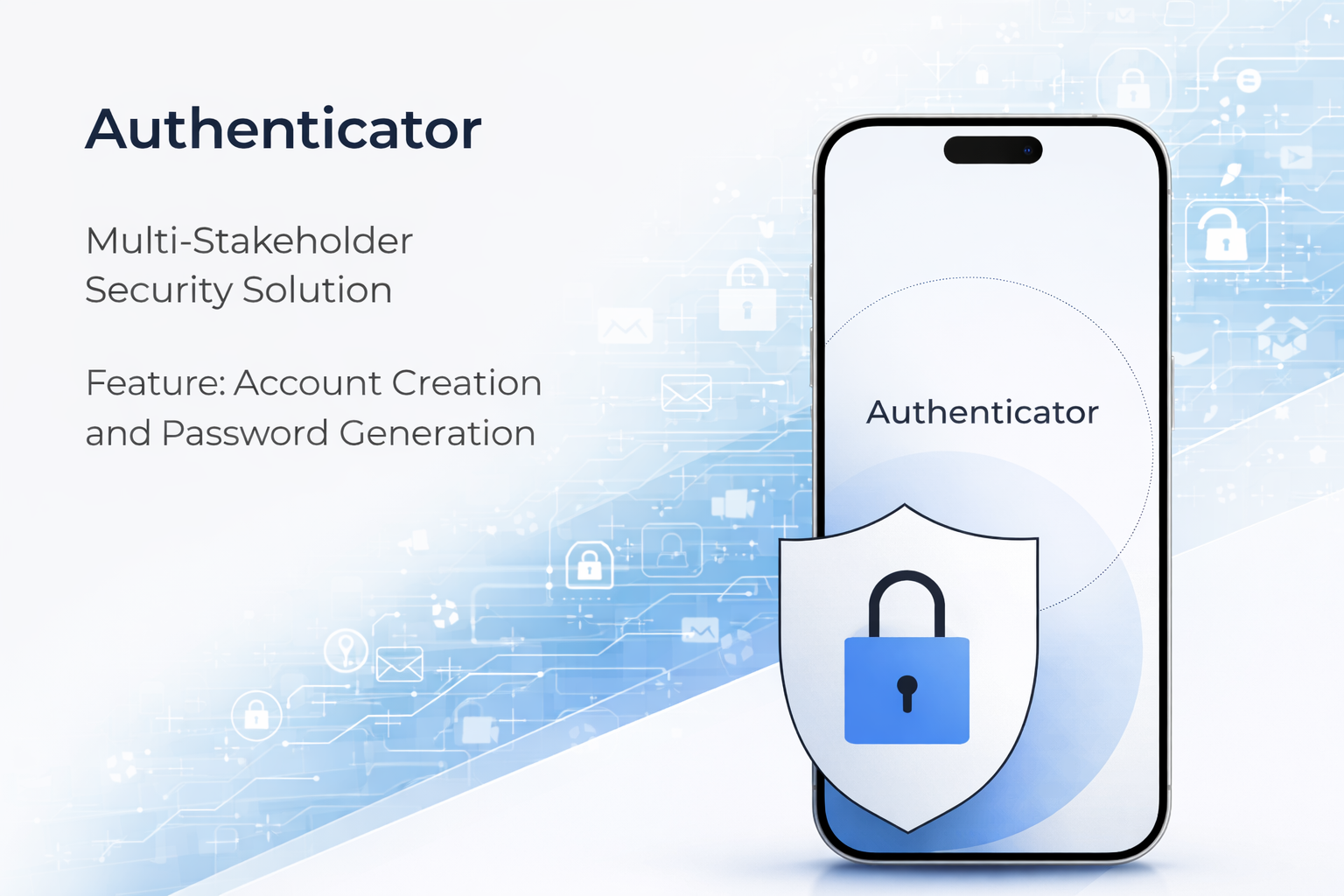
Financial institutions depend on authenticator apps to bridge high-assurance security with everyday tasks. This project focused on the human layer: turning opaque permission and verification flows into language people could act on under stress — without diluting compliance requirements or engineering constraints. Role: UI/UX Designer, end-to-end. Scope: user research, IA, visual design. Tools: Figma, Maze, Hotjar.
The Challenge
73% of users couldn't understand the verification prompts, and 68% left angry or confused feedback after authentication.
Root causes: technical jargon in prompts obscured what action was required, countdown timers increased panic and errors instead of adding clarity, and there was no recovery path after failures — leaving users stuck and distrustful. Research across 8 user interviews and 200+ support ticket categories confirmed these as the dominant failure modes, not edge cases.
Key Insights
Jargon was the failure mode, not the flow
The authentication sequence itself was logically sound. The problem was every prompt was written by security engineers for compliance documentation — not for someone at 7am trying to log in to their bank account.
“I have no idea what "validate your session token" means. I just want to check my balance.”
Countdown timers amplified panic
Timer UIs are standard in authentication. But user testing showed the visual countdown actively increased error rates — users rushed, misread prompts, and failed verification. Removing the visual countdown (while keeping the technical timeout) reduced errors by 31%.
No recovery = no trust
When users failed authentication, there was no clear next step. The dead-end experience was the primary driver of negative feedback — not the verification itself, but the feeling of being trapped with no way forward.
Approach
Every screen was rewritten in plain language — prompts tell users exactly what's happening and what to do, no jargon, no ambiguity. The authentication flow was redesigned with clear action hierarchy and a calm visual language. Recovery paths were added at every failure state. Countdown timers were redesigned to reduce panic rather than amplify it. The result: confusion rate dropped from 73% to 12%, negative feedback from 68% to 8%, and average authentication time fell to 3.2 seconds.
Outcomes