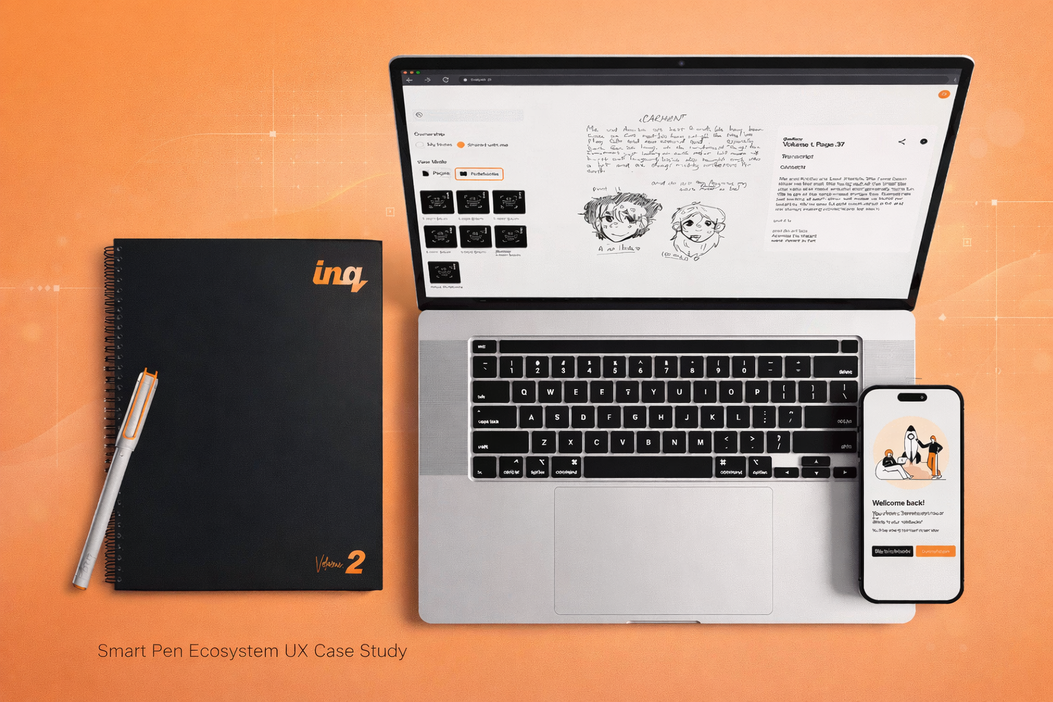
Overview
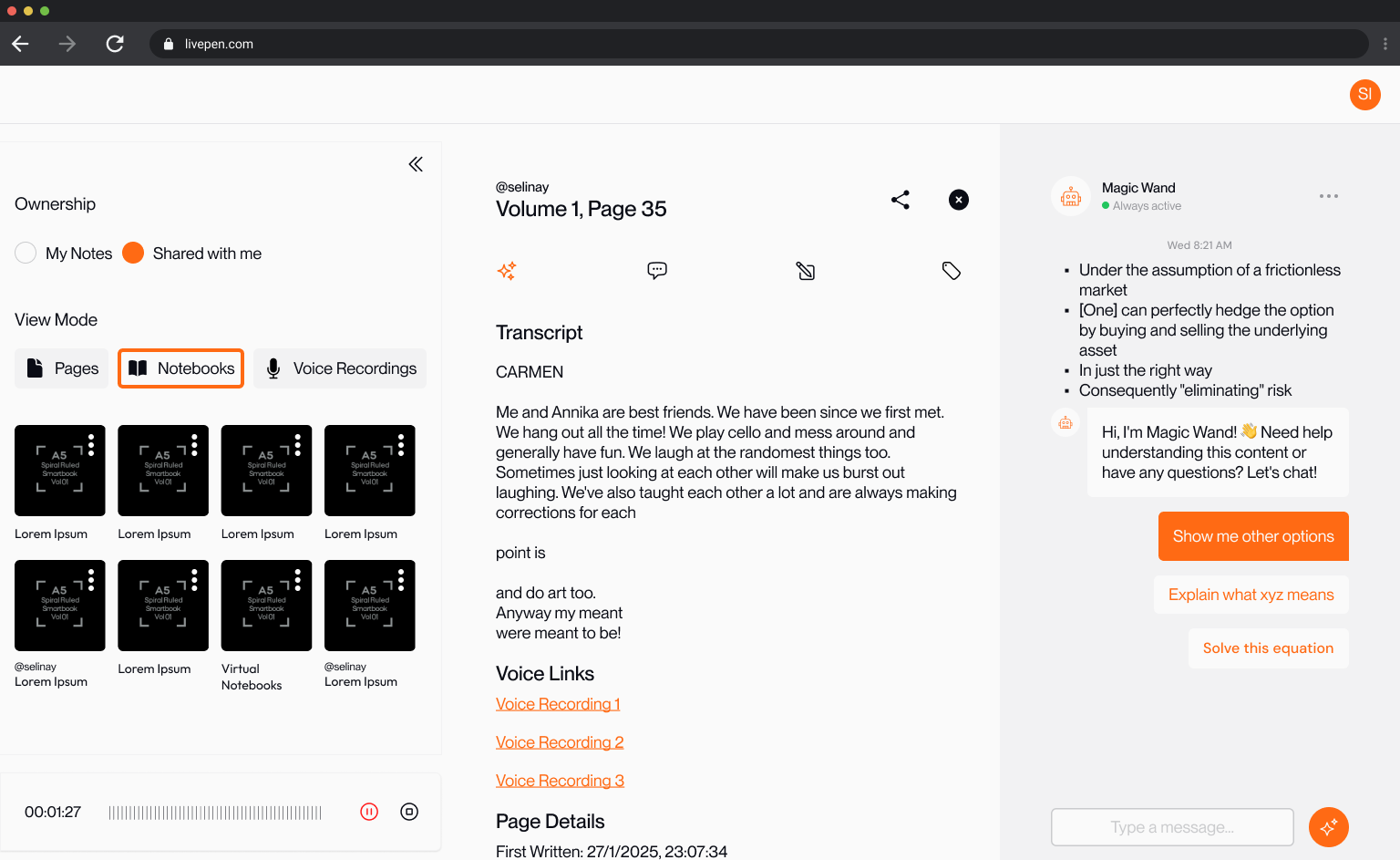
Inq is a smart pen ecosystem that eliminates the cognitive tax of switching between physical and digital note-taking. Rather than forcing users to abandon their natural writing behavior, the product meets them where they already are — on paper — and seamlessly surfaces that content in a structured digital environment.
The Challenge
The core problem was a mental model mismatch.
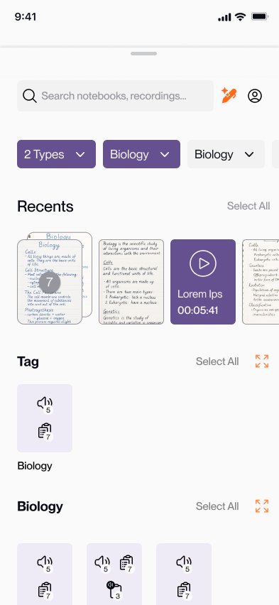
Users think in pages and notebooks, not files and folders. Existing note digitization apps imposed a flat-list paradigm that conflicted with how handwriters naturally organize information, creating navigational friction and high cognitive load. The result: users abandoned the digital layer entirely, defeating the product's core value proposition.
Key Insights
Mental model mismatch, not a feature gap
Users weren't abandoning the app because it lacked features — they abandoned it because the folder-and-file paradigm felt alien next to how they actually thought about their notes. The fix wasn't a new feature; it was a new conceptual model.
Context disappearing was the core anxiety
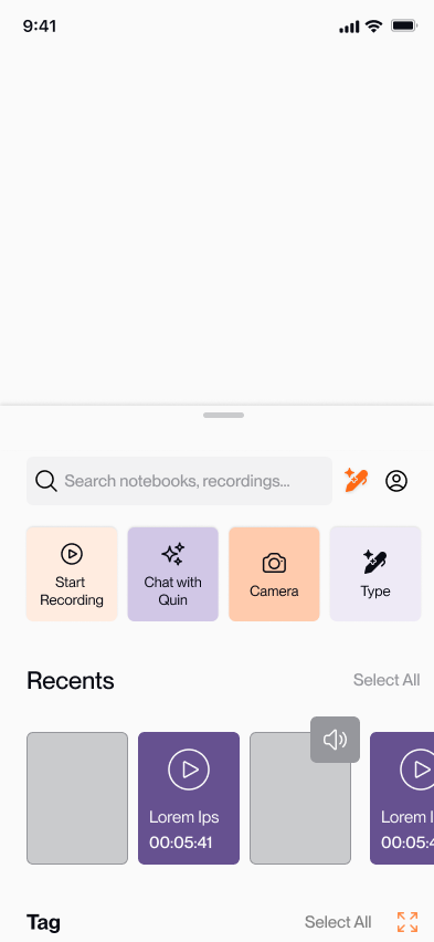
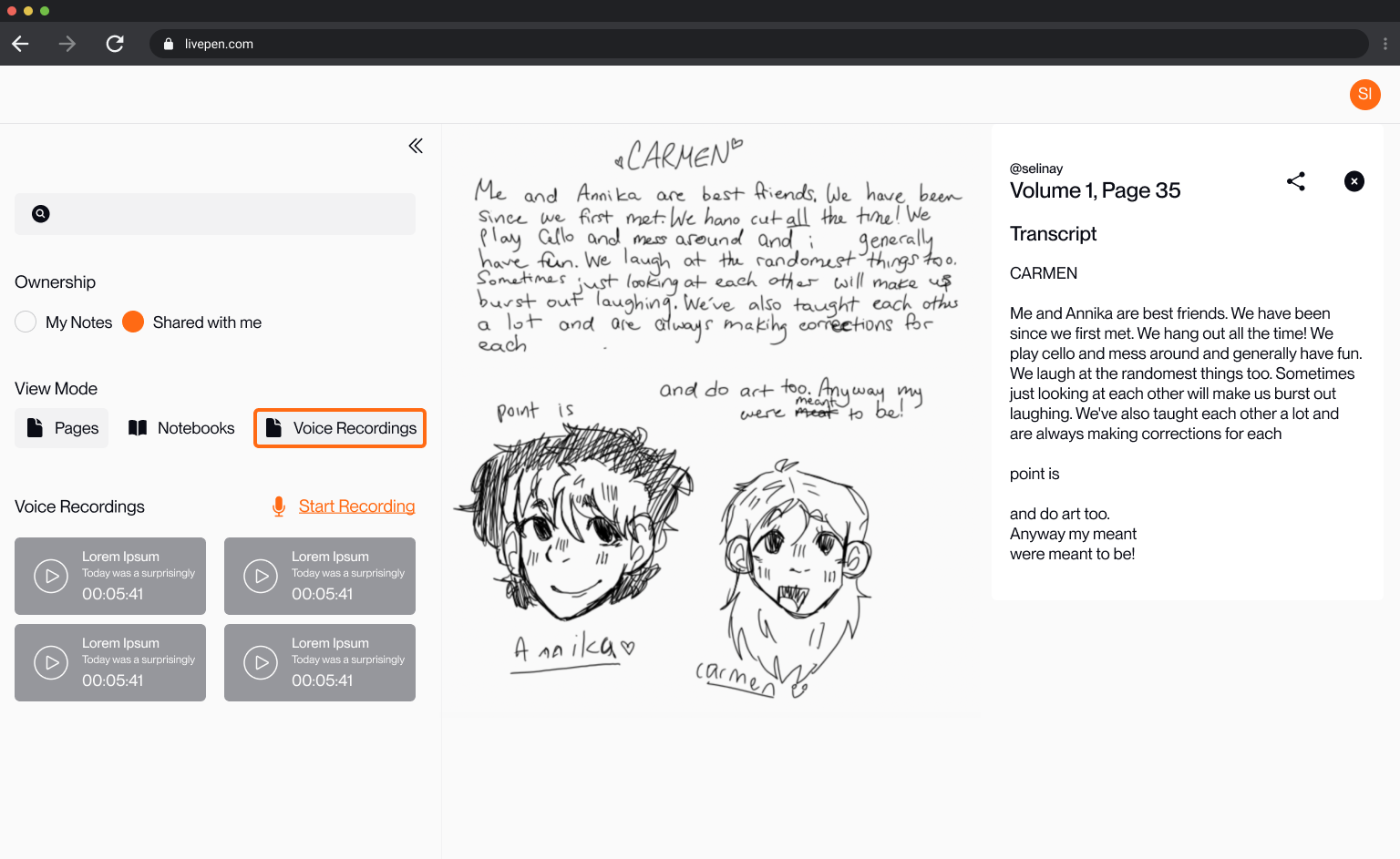
Whenever users opened search or filters, their current page disappeared. This created persistent anxiety — "will I find my way back?" Keeping the canvas always visible removed the fear without changing the functionality.
Screens & Visuals
Approach
We redesigned the navigation architecture around spatial context rather than file management. The current page remains permanently visible as the primary canvas — borrowing from Apple Maps' always-visible map model — eliminating the disorientation users felt when UI elements displaced their content. Search and filters surface from the bottom as overlays, keeping users anchored to their page without losing context. Feature-specific prototypes were built in direct collaboration with engineers to align on animation timing and sync logic, ensuring the shipped product matched the intended interaction quality.
Outcomes