The Brief
GROVE is a direct-to-consumer botanical skincare brand targeting urban professionals who demand both clinical transparency and considered design. A complete brand system built from identity to packaging to editorial campaign direction. The name "Grove" anchors the brand in something grounded and alive — not a single plant or ingredient, but an entire ecosystem. Fictional brand project.
The Challenge
The brief: build a brand system that lives between the lab and the forest — precise, confident, and quietly beautiful.
The botanical skincare market is visually saturated with earthy tones and hand-drawn botanicals. GROVE needed to signal premium efficacy and natural credibility simultaneously, without falling into greenwashing clichés or the sterile coldness of pharmaceutical packaging. Target audience: 28–42, urban, ingredient-literate — they read labels, distrust greenwashing, and buy design the way they buy product quality.


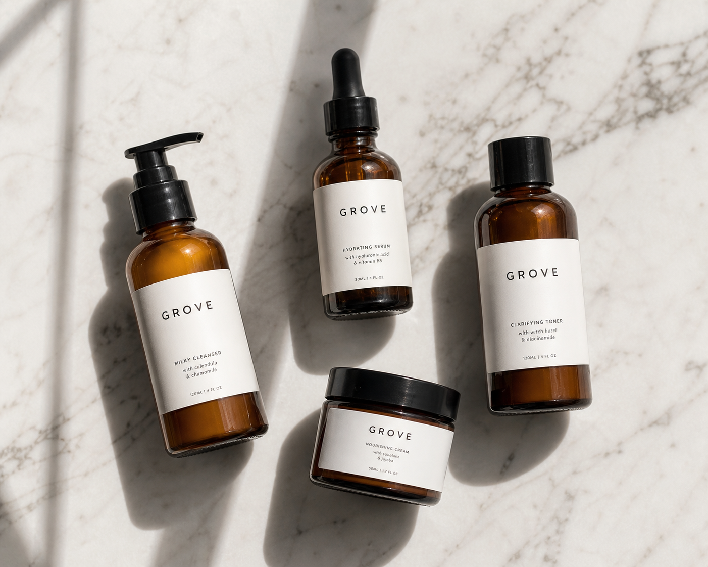
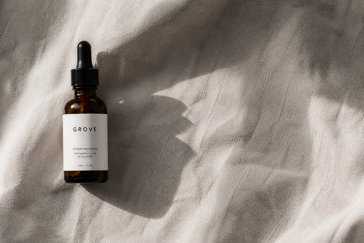
Creative Direction
The identity is built around quiet authority — no wellness buzzwords, no apothecary pastiche. The wordmark is GROVE in Syne 800, tracked tight, all caps — pure wordmark, no mark or icon. The palette reads natural but not rustic: Forest Deep (#0D1C12), Grove Sage (#4A7A58), Warm Cream (#F2EDE4), Bronze Accent (#9A7230). Syne 800 carries the brand voice; Instrument Sans handles all functional copy. The campaign direction, "Where rigour meets the wild," was shot with editorial precision — clean compositions, natural light, ingredients visible but not laboured.