The Brief
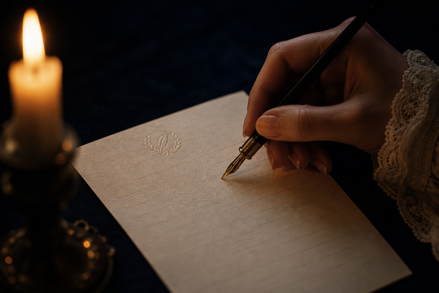
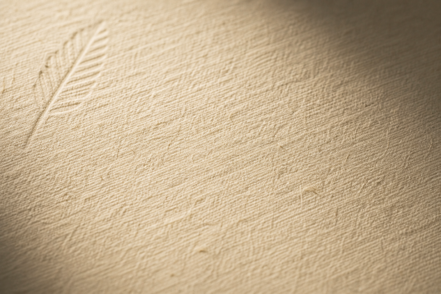
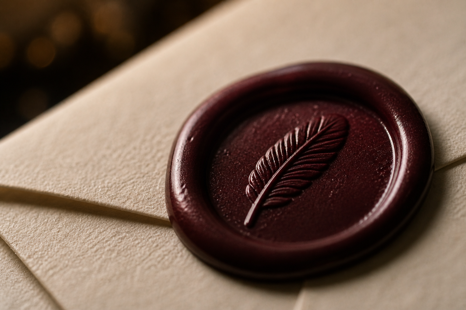
PLUME is a Parisian fine stationery house founded on a single belief: a letter, properly written, outlasts everything. "Écrire, c'est exister." In an age of instant messages and disposable communication, PLUME makes the act of writing a deliberate, sensory ritual — weighted paper, botanical inks, hand-poured wax. The name "Plume" is French for feather — the original writing instrument. Fictional brand project.
The Challenge
The brief: build a brand for the deliberate writer (30–55, cultural, romantic — they still send handwritten notes, they keep letters).
Luxury stationery brands fall into two traps: Swiss minimalism that feels cold, or Victorian ornament that feels like costume. PLUME needed to occupy a third space — intimate and precise, quietly confident, like the tone of someone who writes a beautiful letter and expects it to be read slowly.

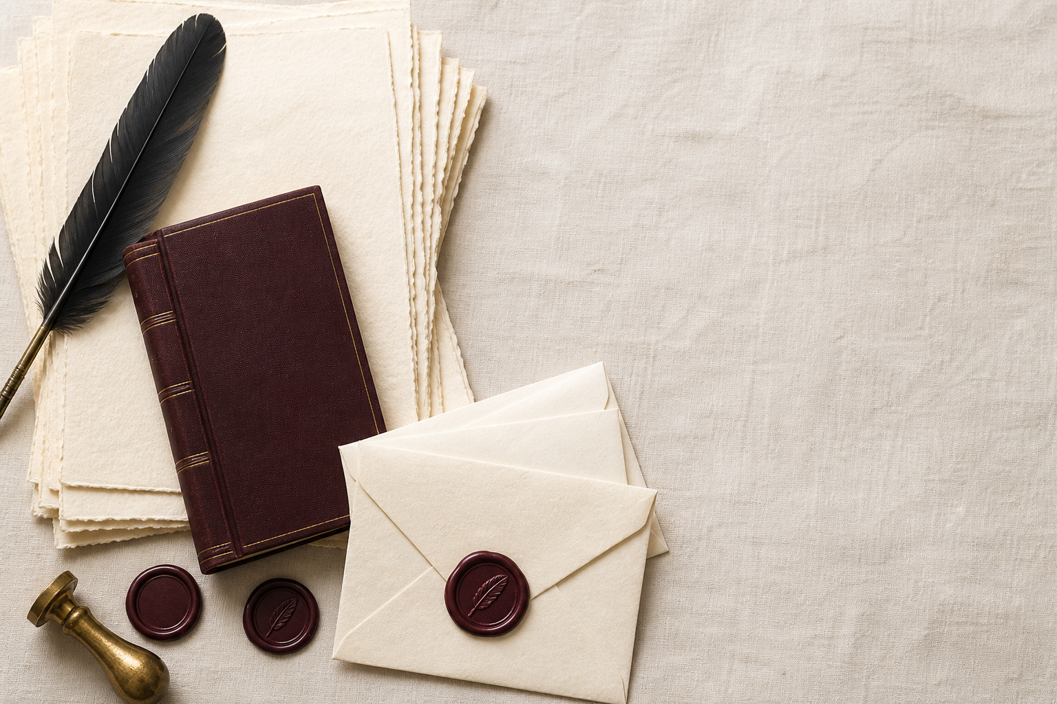
Creative Direction
The logotype is set in Playfair Display Italic 900 — a typeface with strong editorial roots and visible calligraphic influence. The italic angle introduces movement, as if written by hand. Below it, "Papeterie de Luxe · Paris" anchors the brand in place and craft. The palette — Encre (#1A1410), Bordeaux (#4A1528), Rose poudré (#C4899A), Or ancien (#B8952A), Crème (#F5F0E0) — evokes the late hour when letters are written. Packaging uses heavyweight uncoated stock, debossed branding, and wax seal details on premium tiers.