The Brief
LUMA is a contemporary ceramics studio producing functional tableware for daily ritual. Every piece is wheel-thrown in small batches — plates, bowls, mugs, carafes — designed to develop a patina with use. Brand idea: "Form follows feeling — objects made to age beautifully in your hands." The brand lives at the intersection of Scandinavian restraint and Mediterranean warmth. References: Bizen pottery, Axel Salto, Japanese mingei, Lucie Rie.
The Challenge
The brief: build an identity that feels calm without being cold.
The ceramics themselves are the product, so the brand system had to step back and let texture, weight, and imperfection lead. Audience: slow-living enthusiasts, interior-conscious buyers, independent restaurants and coffee houses. Tone: quiet confidence, tactile over digital, warmth without sentimentality. The danger was falling into craft-branding clichés — raw linen textures, hand-lettered scripts — without finding what made LUMA distinctly itself.

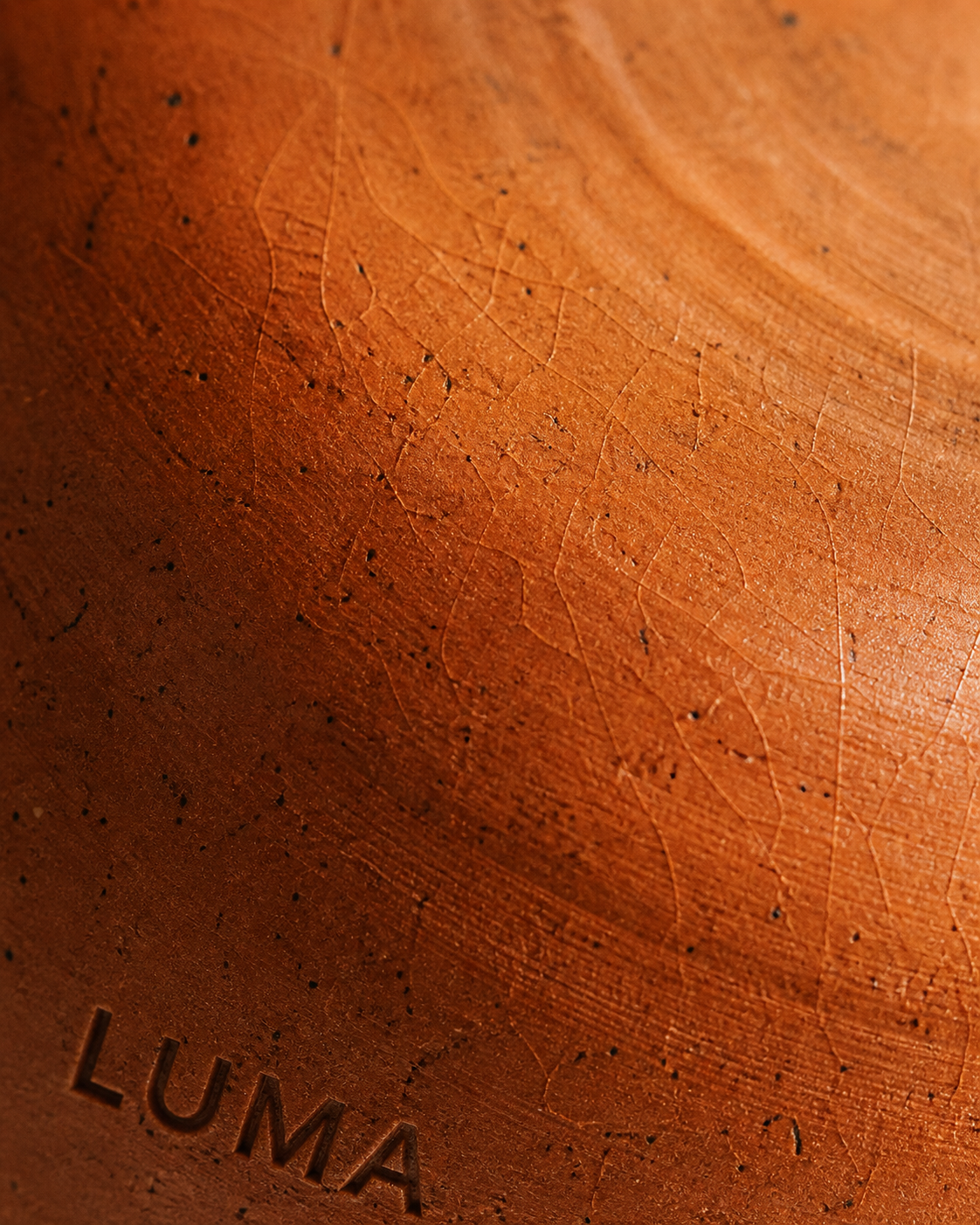
Creative Direction
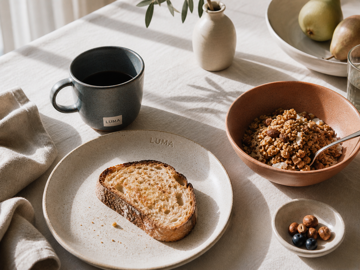
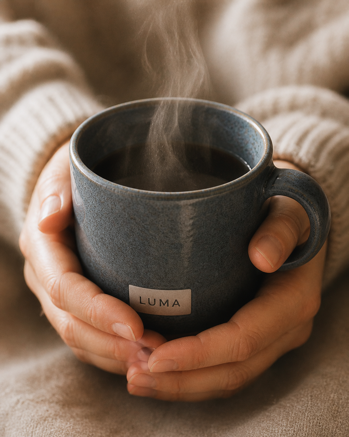
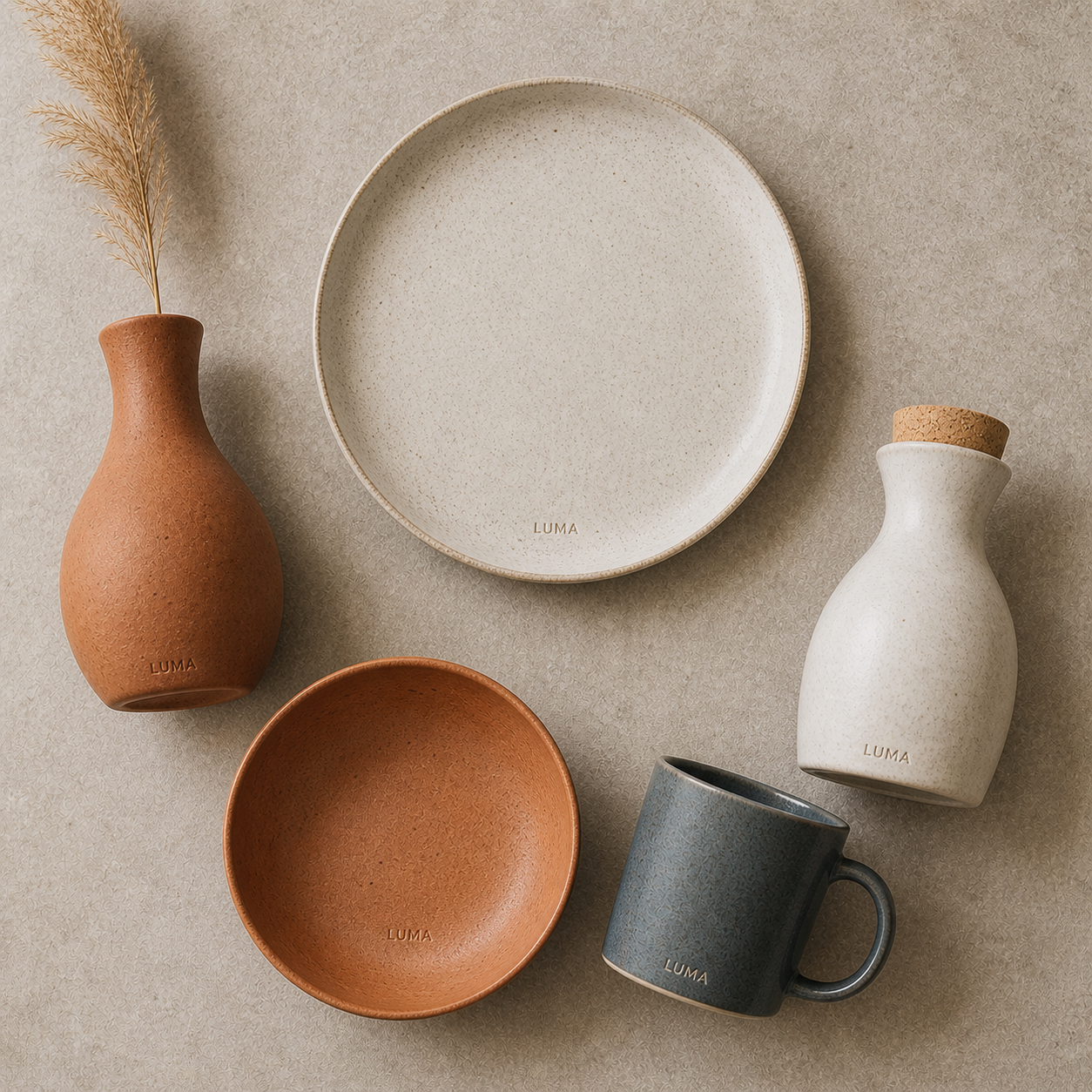
The palette was taken directly from the ceramics: Linen (#f7f3ee), Warm Grey (#c8bfb2), Terracotta (#c4622d), Slate (#4a5c66). The wordmark uses DM Serif Display — open, rounded letterforms echoing the curves of thrown pottery, standing quietly like objects on a shelf. The optional italic variant in terracotta is used for campaign headlines. DM Serif Display for warmth, Syne for all functional text. The campaign "A Good Morning" was shot in natural light only — every image shows a piece in mid-use, never posed.