The Brief
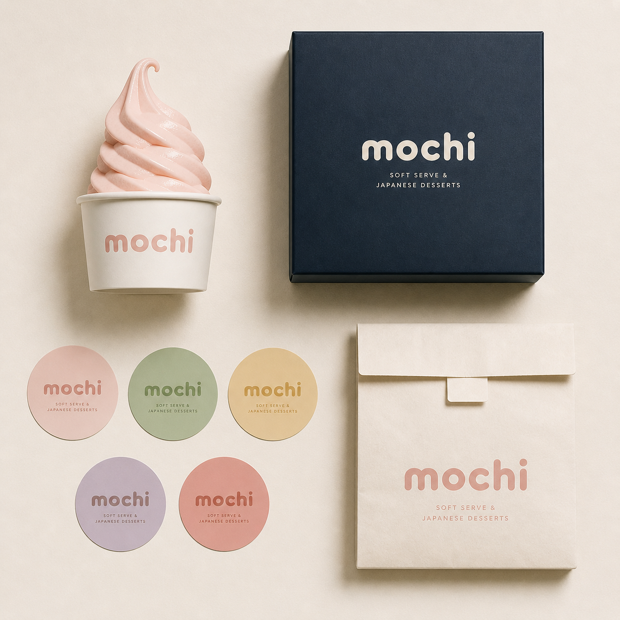
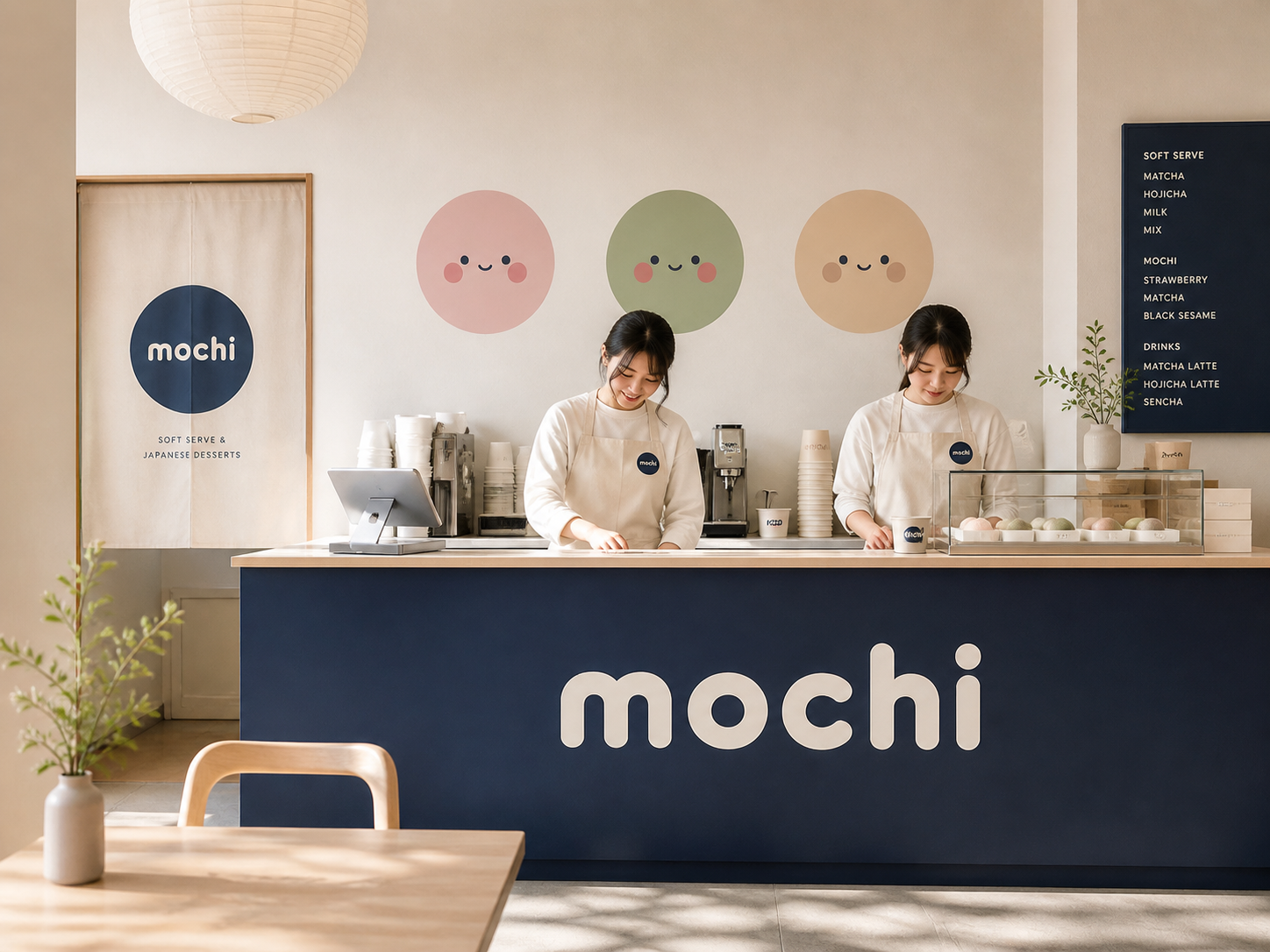
MOCHI is a Japanese-inspired soft serve and rice cake café bringing everyday sweetness to European cities. Brief: build a brand that feels warm, bouncy, and completely impossible to ignore — from the cup in your hand to the billboard above your head. Brand idea: "Tiny moments. Maximum joy. Every flavour is a feeling." Scope: brand, mascot, packaging, campaign. Amsterdam, NL.
The Challenge
The brand draws from Japanese kawaii culture without being childish — for anyone who believes a small treat can genuinely make the day better and wants to photograph it first.
The challenge: most café brands fall into generic minimalism or loud maximalism that exhausts. MOCHI needed to feel immediately joyful without being disposable. The mascot concept had to work across product packaging, environmental graphics, staff aprons, and social media without losing legibility at any scale.
Creative Thinking
Joy is a design constraint, not a direction
The brief said "joyful." Most café brands interpret that as bright colors and rounded fonts. We defined joy more precisely: the feeling of finding something unexpectedly delightful — not loud, not performative, but genuinely surprising.
The mascot needed to scale without an art department
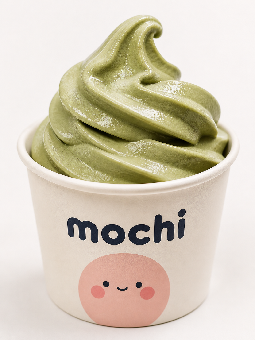
Mochi needed to work on a 30mm stamp and a 3m mural without losing recognition. The solution: a locked geometric construction grid — every proportion mathematically defined so anyone could reproduce the character at any scale.
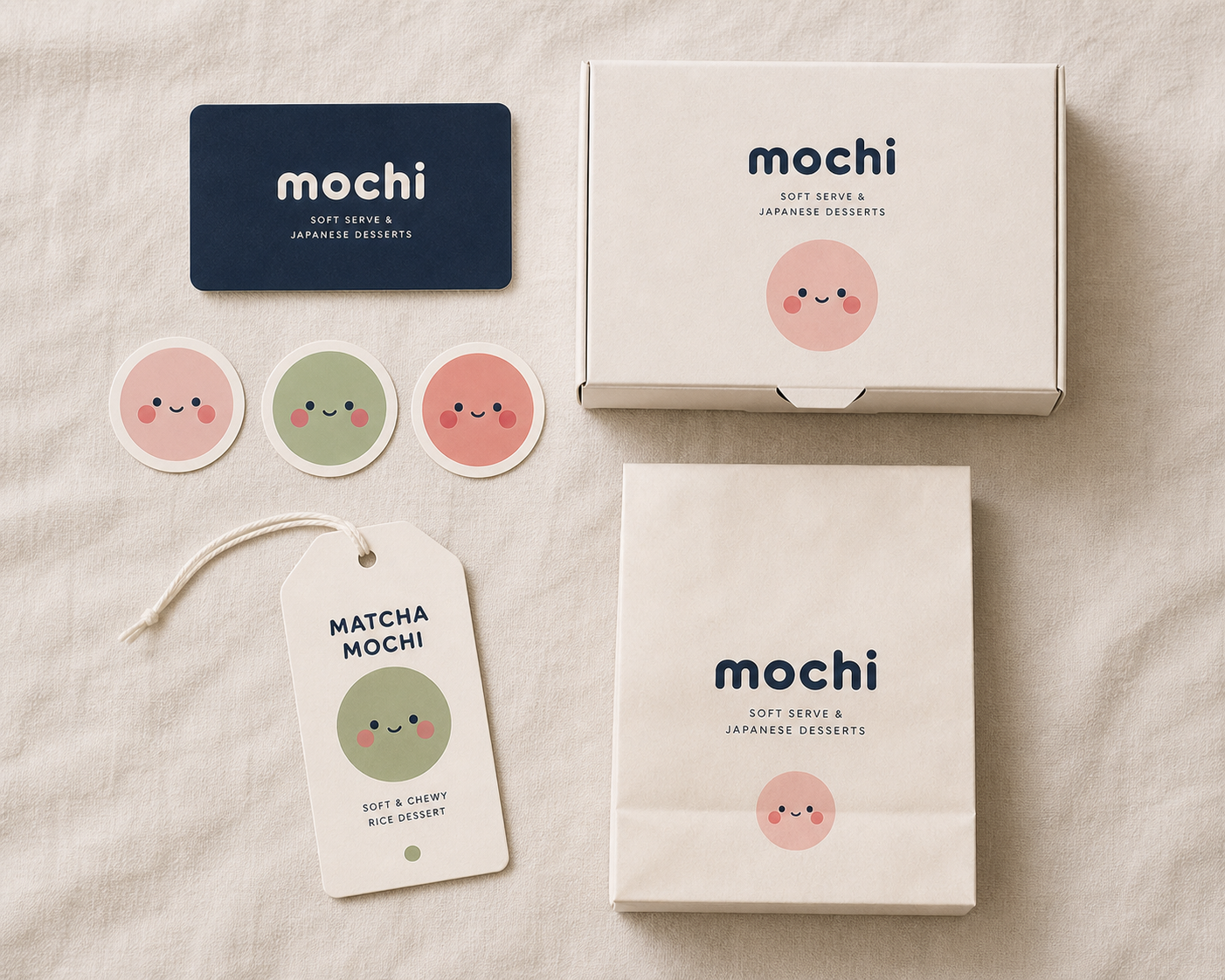
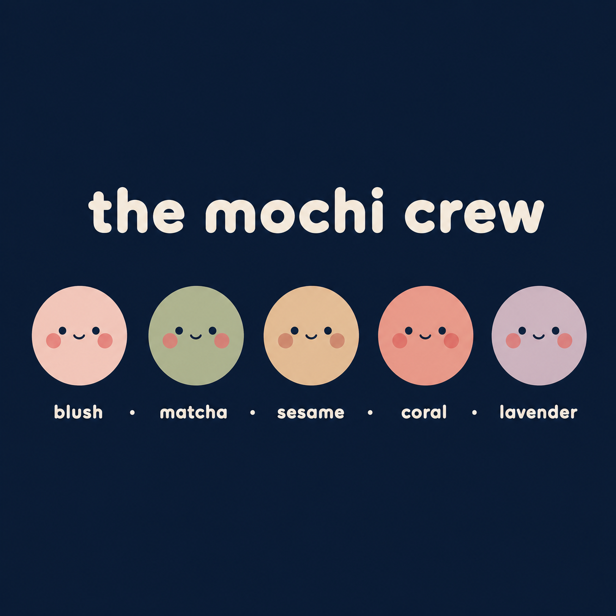
Five flavours, one character system
Rather than one generic mascot, each flavour personality was a distinct expression of the same geometric system — same proportions, different colour palette and micro-expression. Collectible by design.
Creative Direction
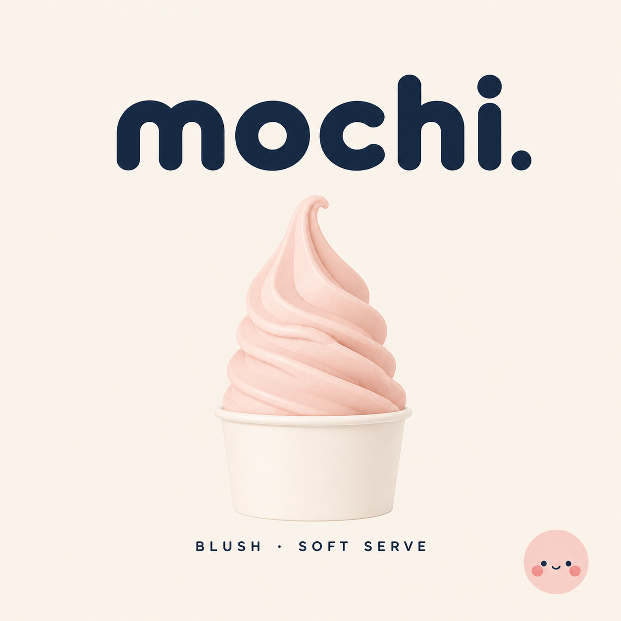
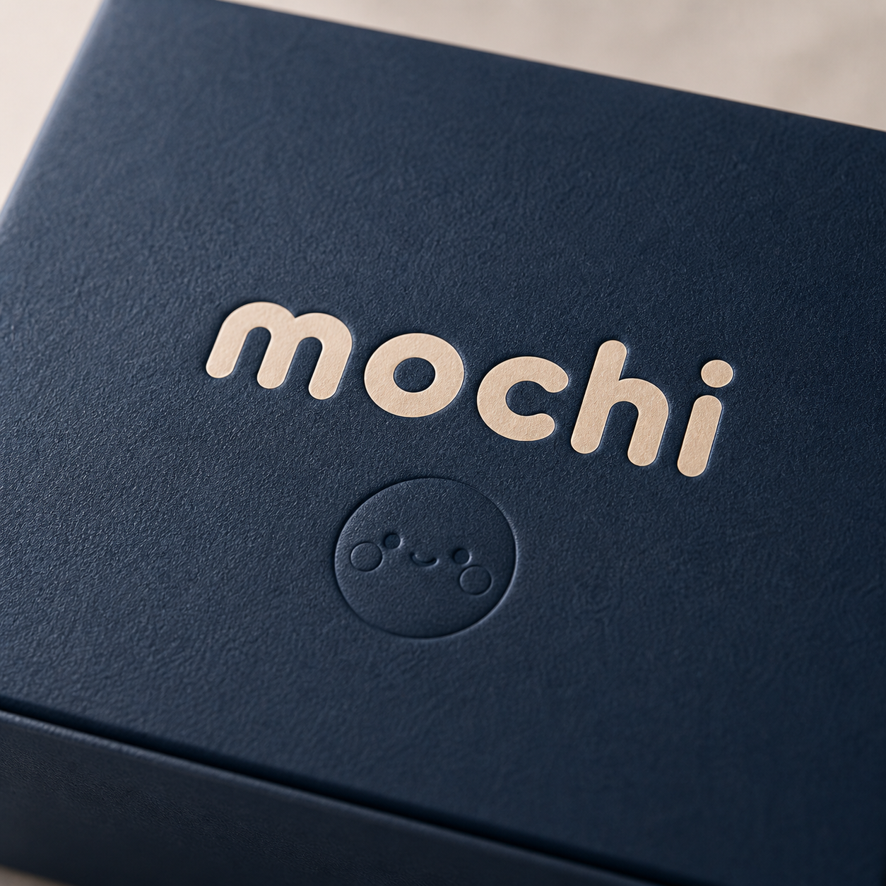
The brand is built around Mochi — a squishy, round, perpetually delighted character who comes in five flavour personalities (each a different colour, shape, and mood). The mascot is intentionally geometric: a perfect circle, two symmetric eyes, blush cheeks at 45°, and a half-arc mouth — every element proportionally locked. The wordmark uses Fredoka, a rounded display typeface with the same soft warmth as the product, with the "c" picking up the coral accent. The campaign "Tiny Moments" ran across Instagram, outdoor, and in-store with natural-light photography of products in mid-use.
“We came to Selinay with a logo idea and left with a full world — packaging, campaign tone, café signage, social templates. She understood that MOCHI wasn't just a dessert brand, it was a feeling. Every asset felt cohesive and deeply considered.”